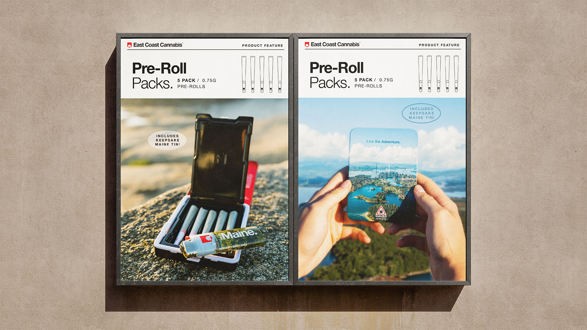
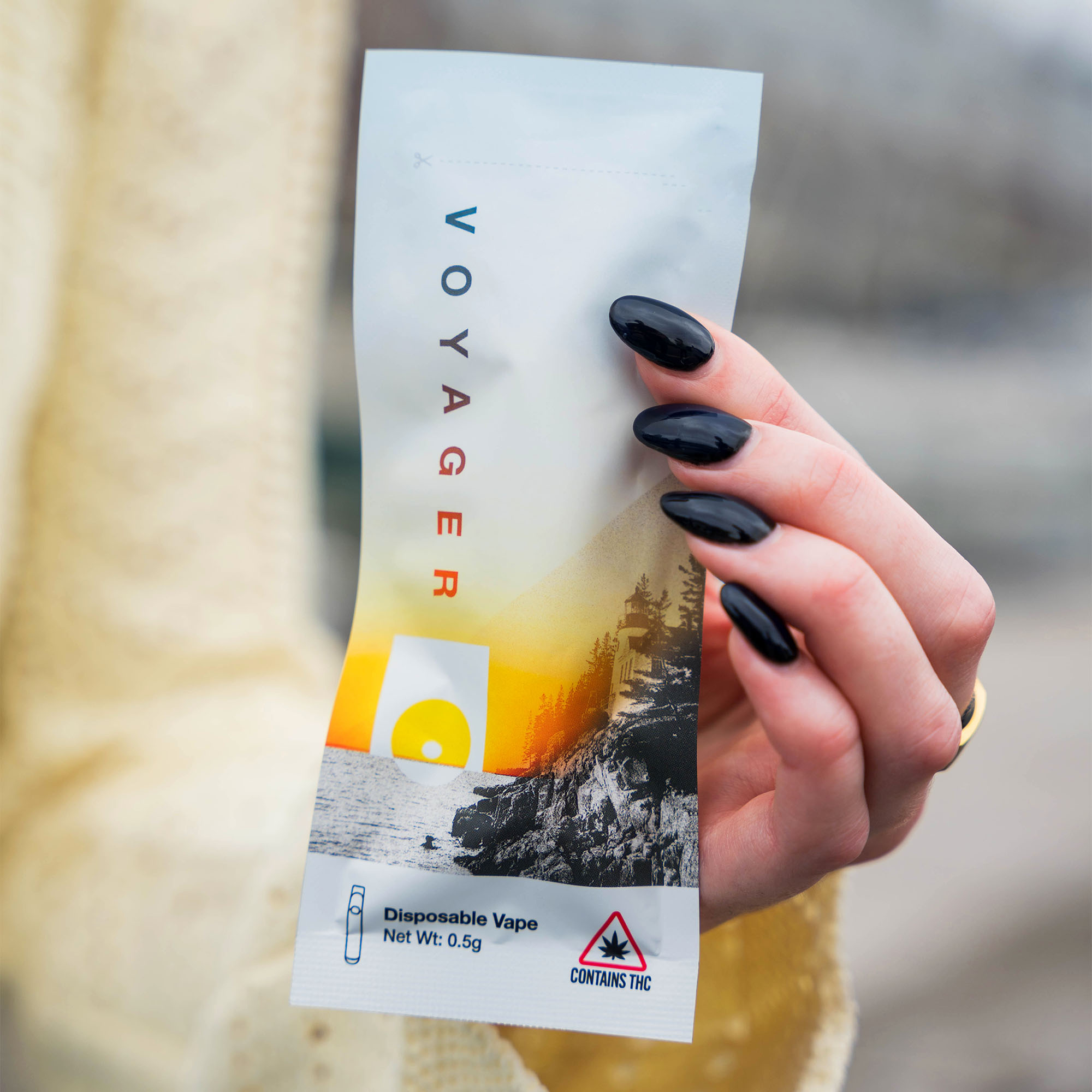
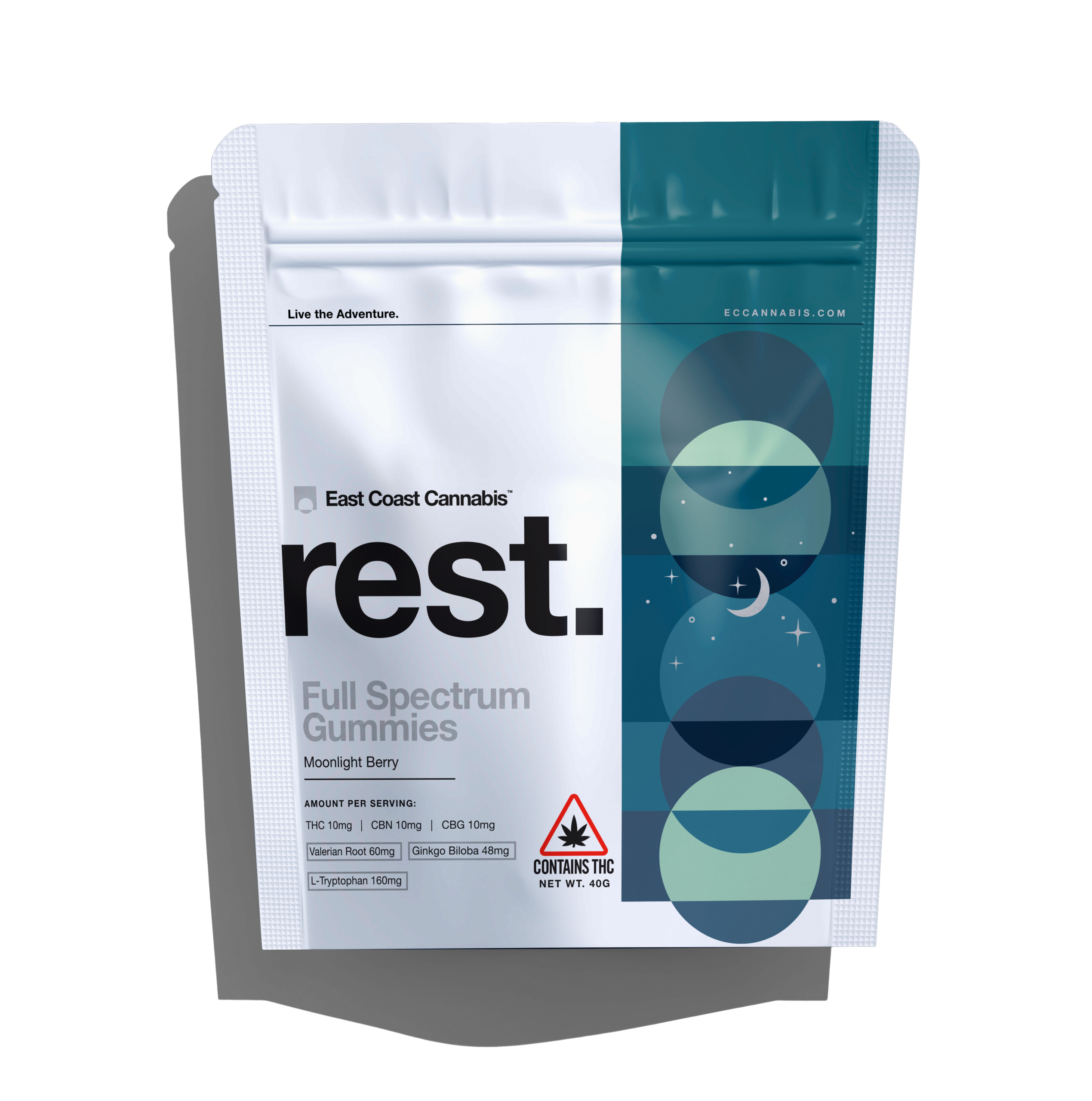
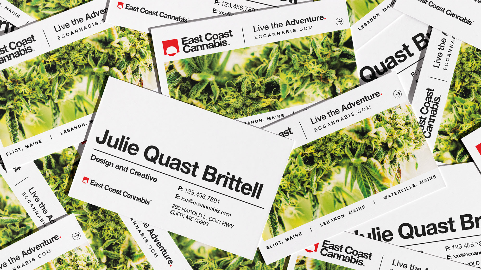
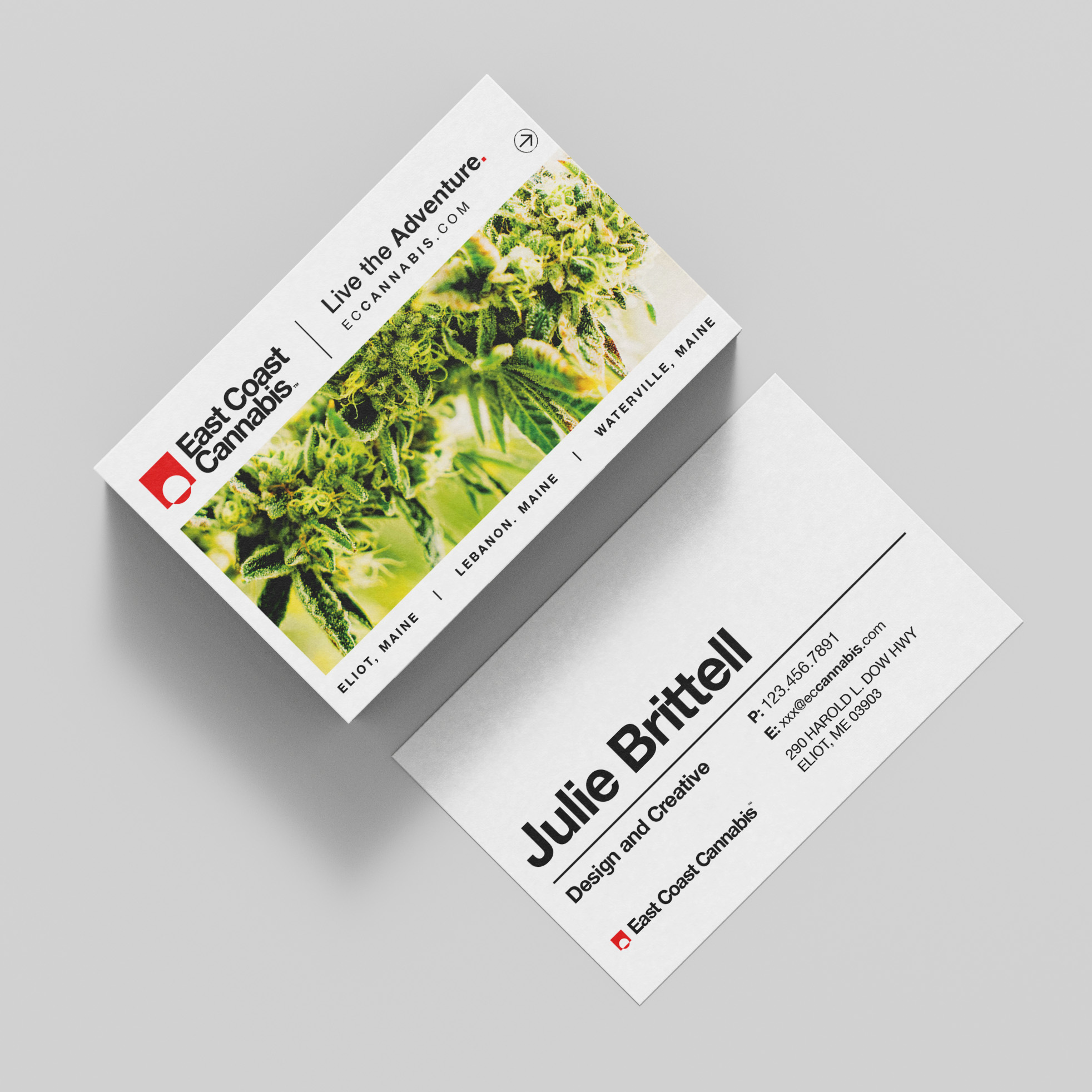
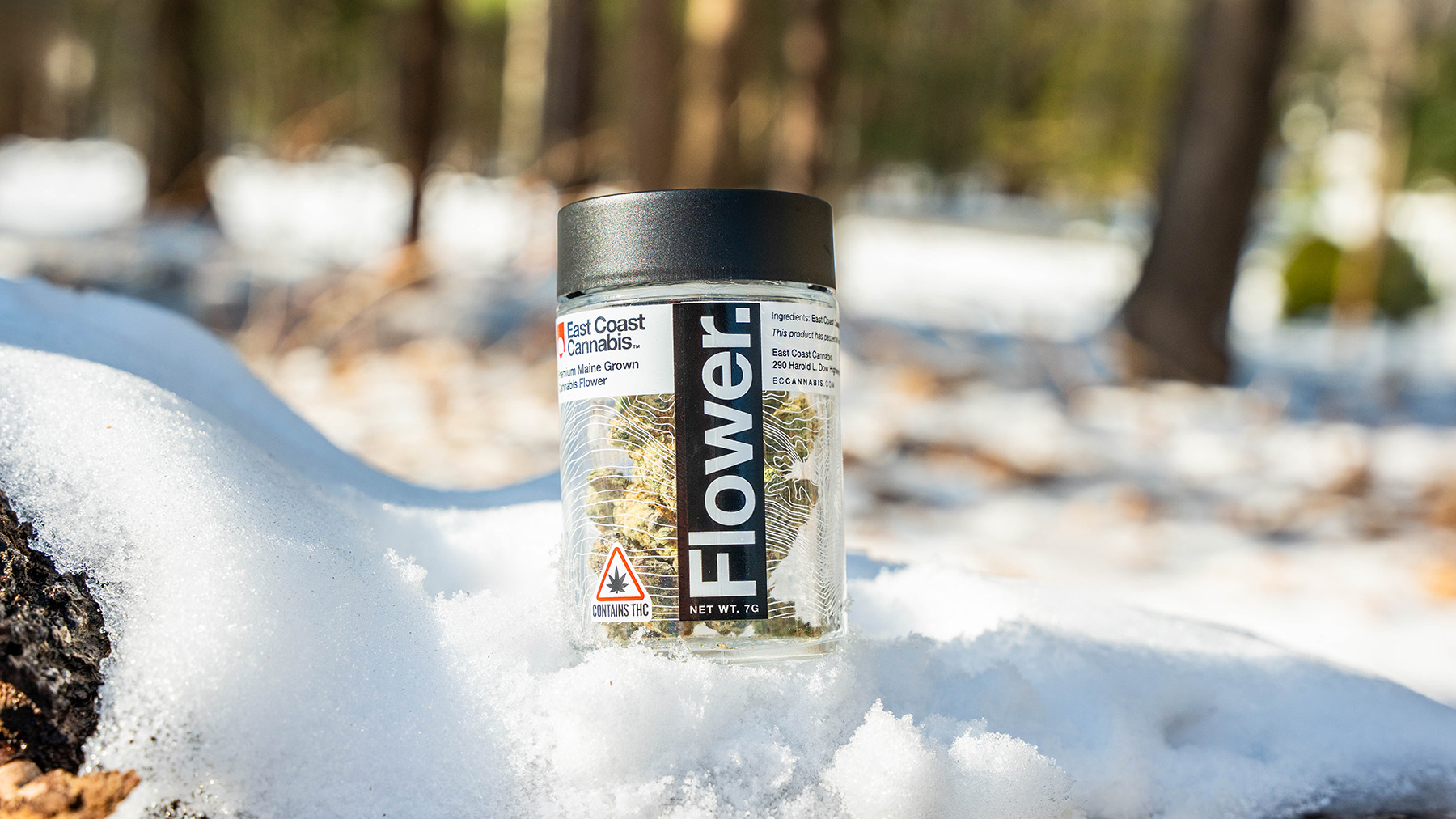
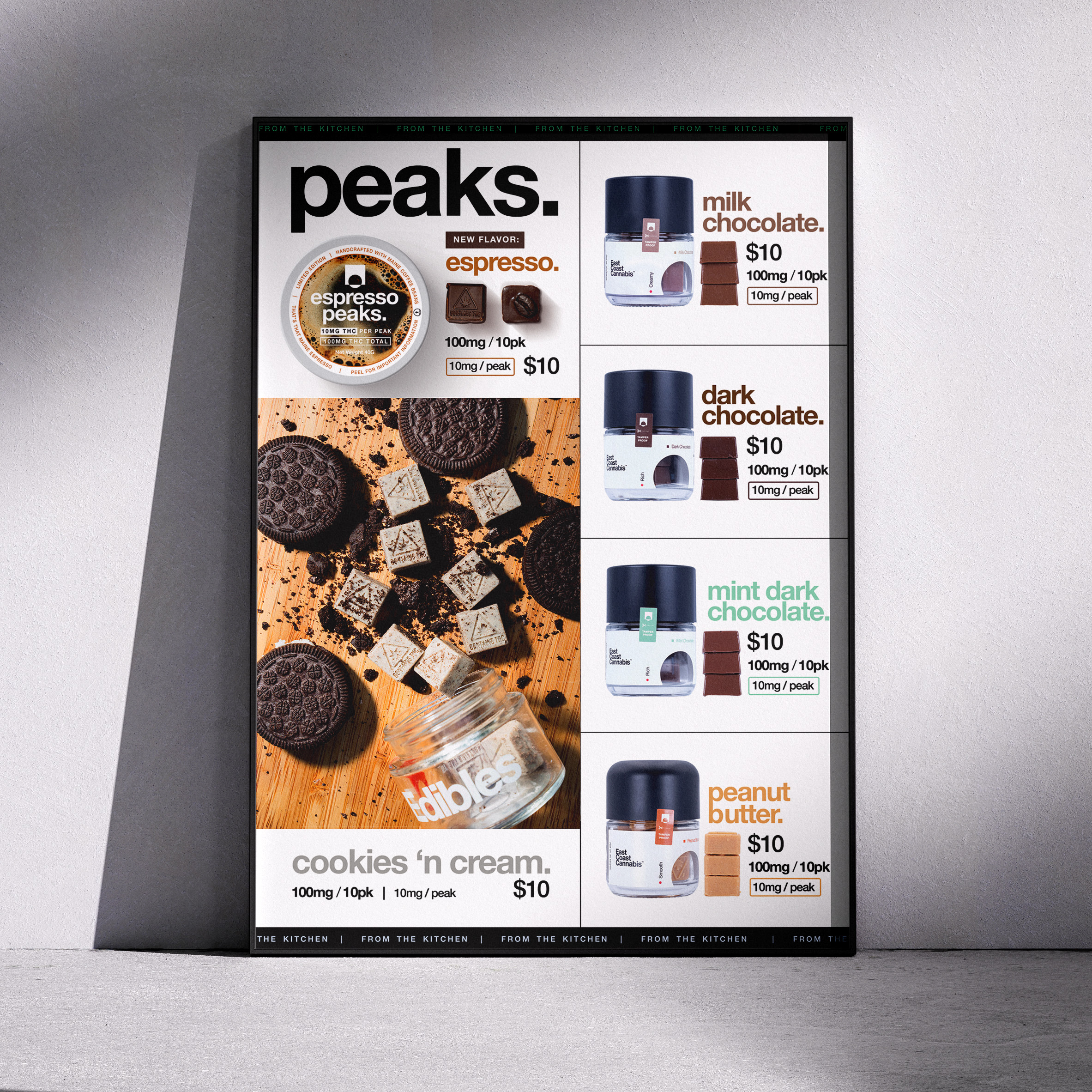
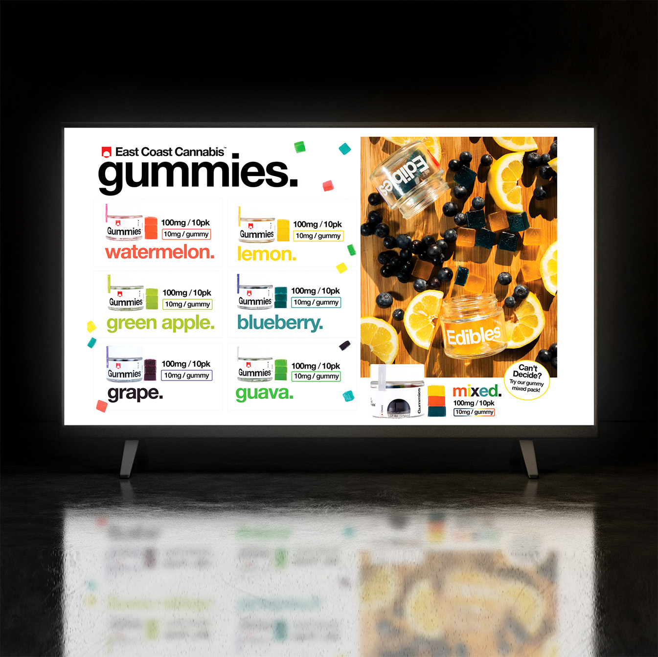
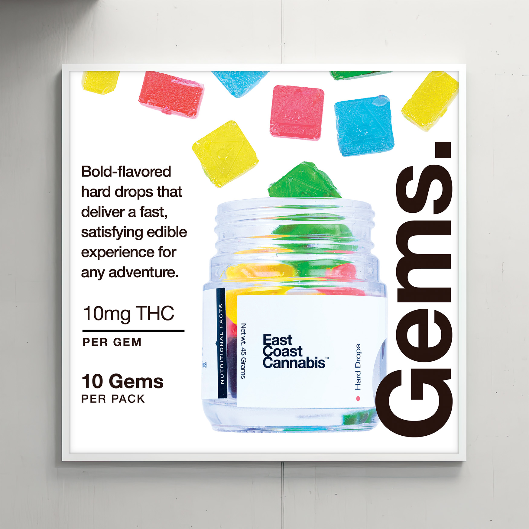
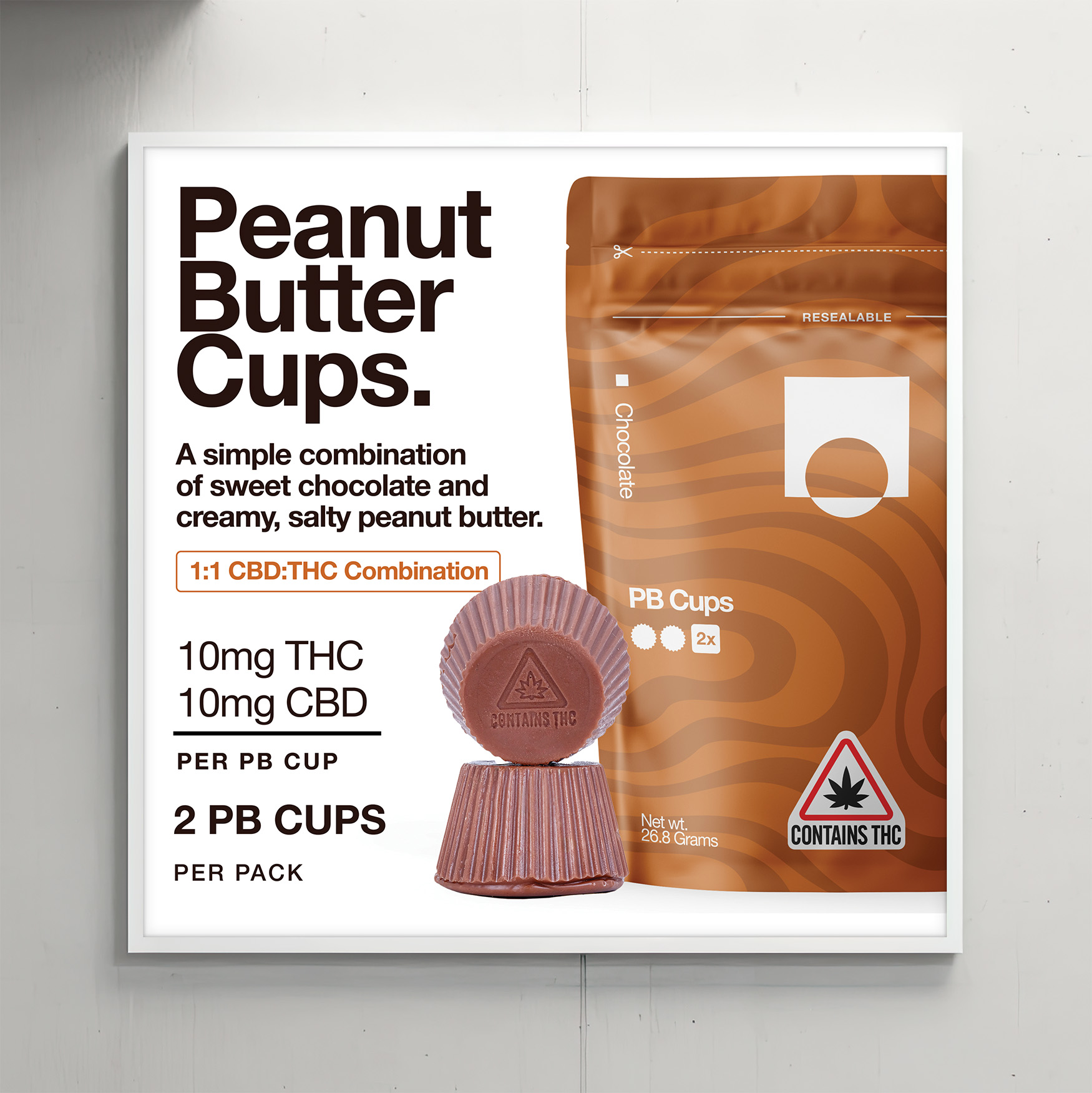
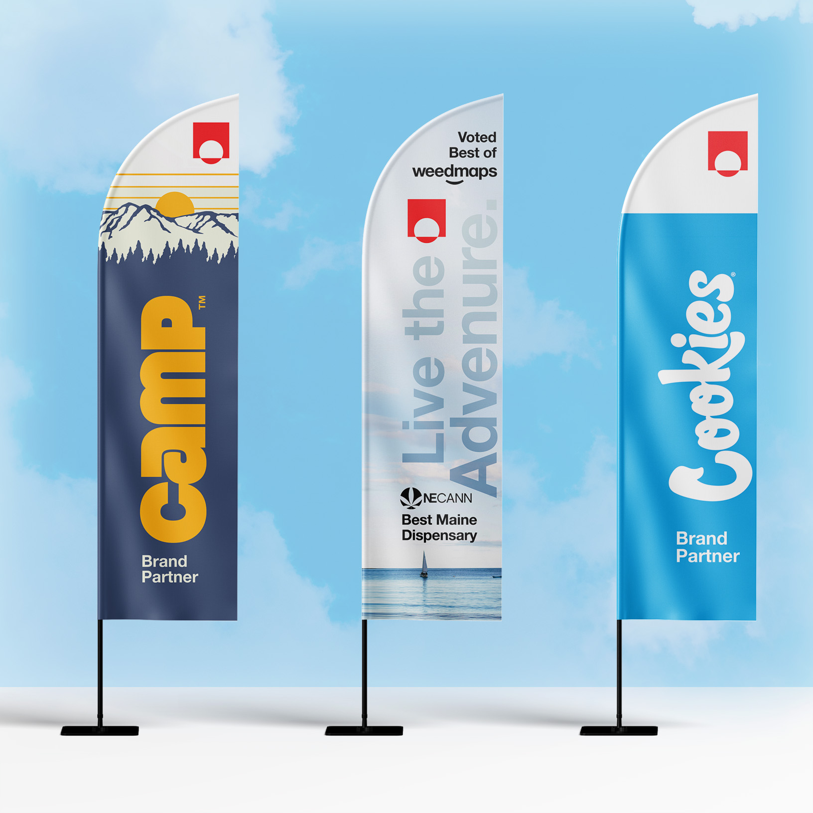
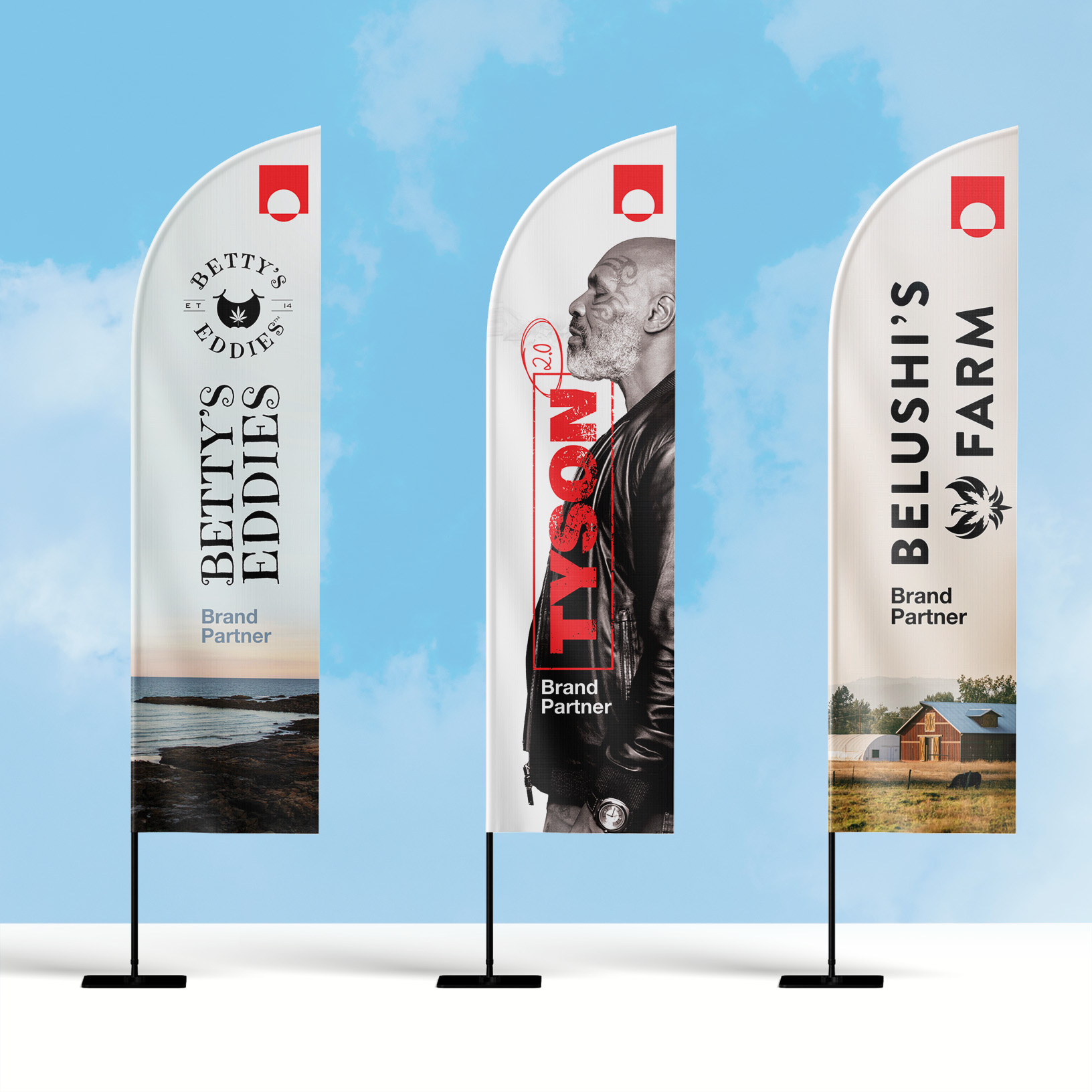
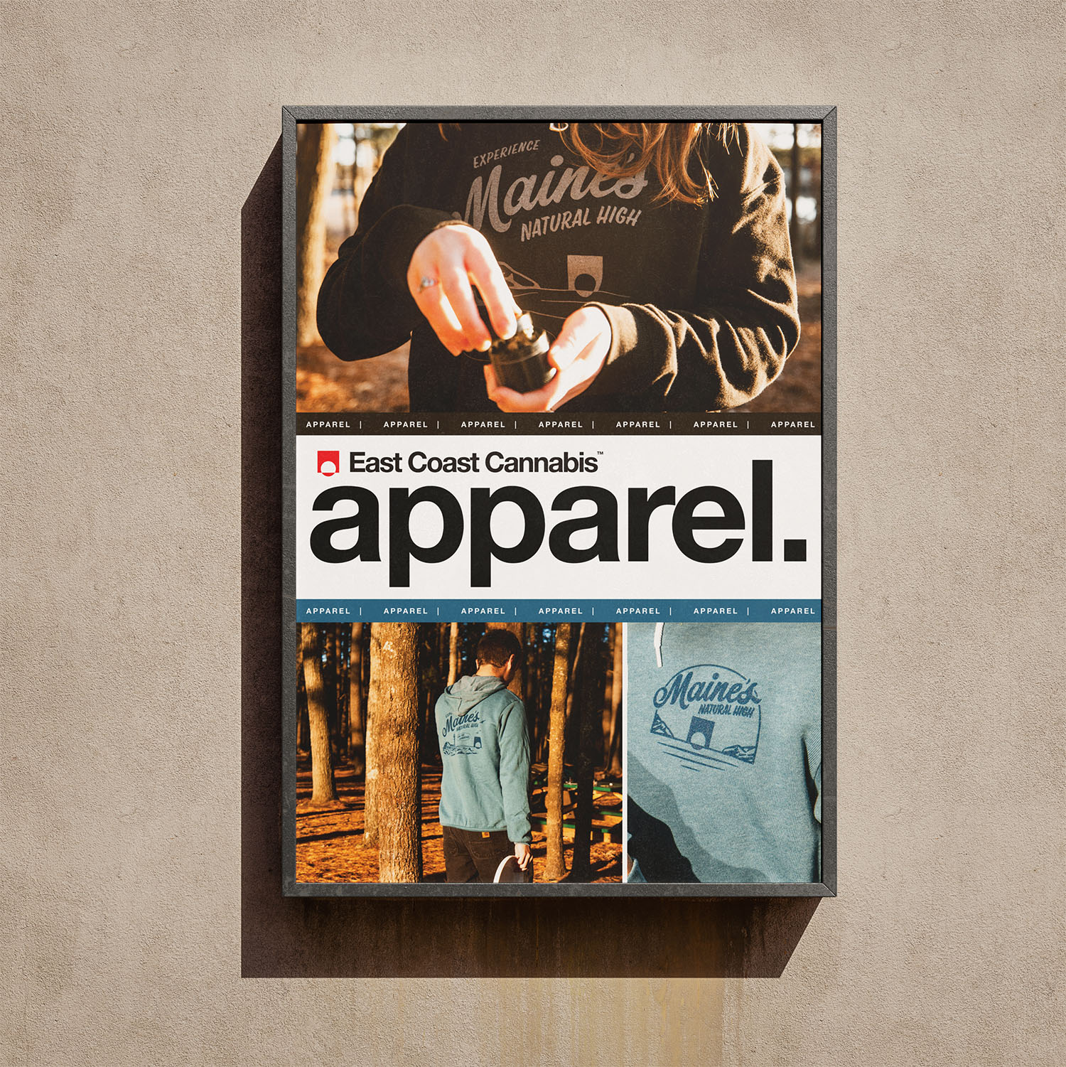
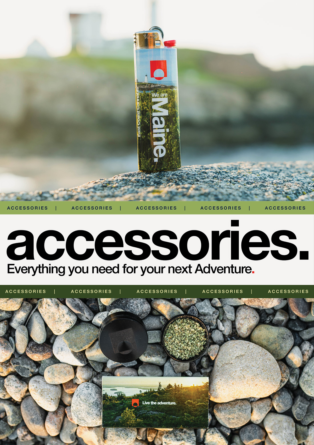
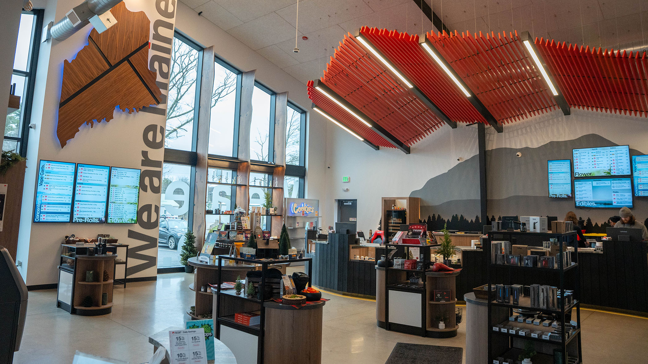
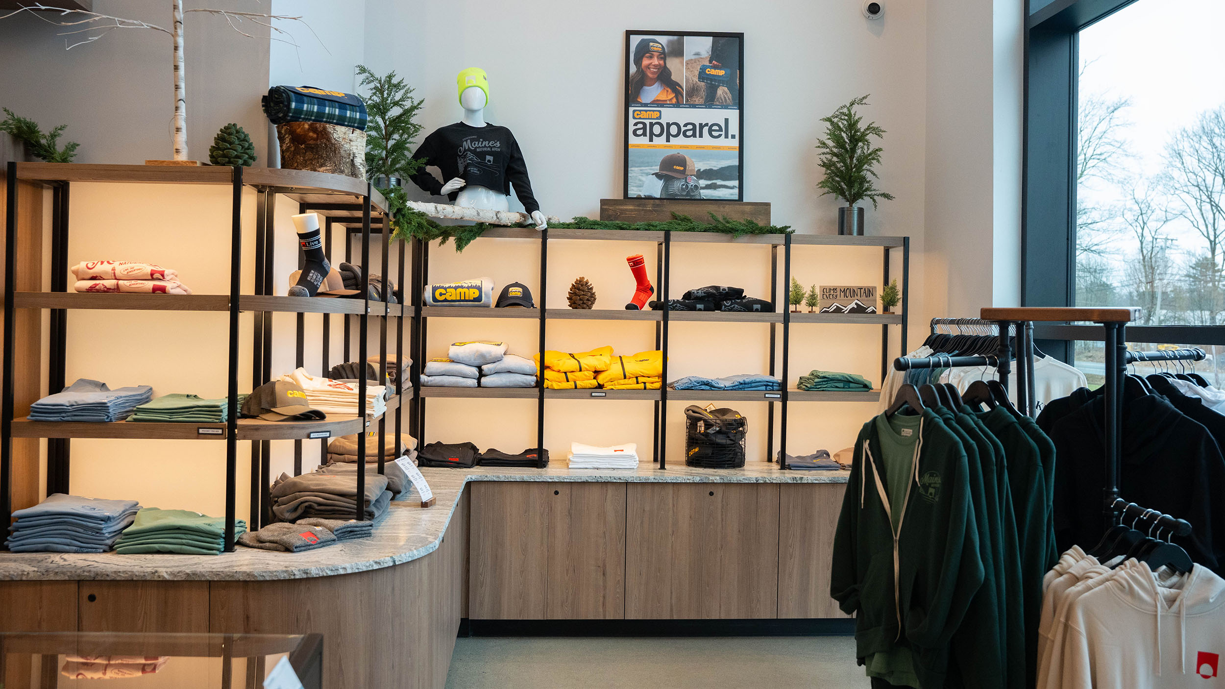
East Coast Cannabis brought design in-house to help unify and evolve its brand as it expanded across Maine’s competitive cannabis market. Rooted in Swiss Design principles — clean typography, structured grids, and Helvetica Neue — the brand already stood apart visually. The opportunity was to build on that foundation by adding warmth, light, and personality across every touchpoint.
Creative direction expanded through packaging design, in-store graphics, business cards, and a full website redesign, with a focus on making the brand feel more colorful, modern, and approachable. Products were developed from concept to completion, weaving thoughtful design into the retail experience. As the first internal voice for creative and design, the role centered on advocating for the consumer — shaping a shopping experience that felt beautiful, seamless, and intentional.
