Peaks
ROLE
Packaging Design, Creative Direction, Art Direction, Marketing Campaign Strategy
CLIENT
East Coast Cannabis
PHOTOGRAPHY
DLP Social
Packaging Design / Product Marketing / Brand Extension / Retail Promotions
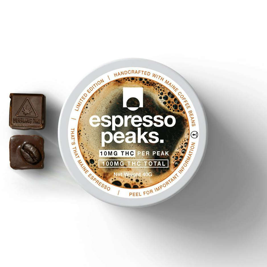
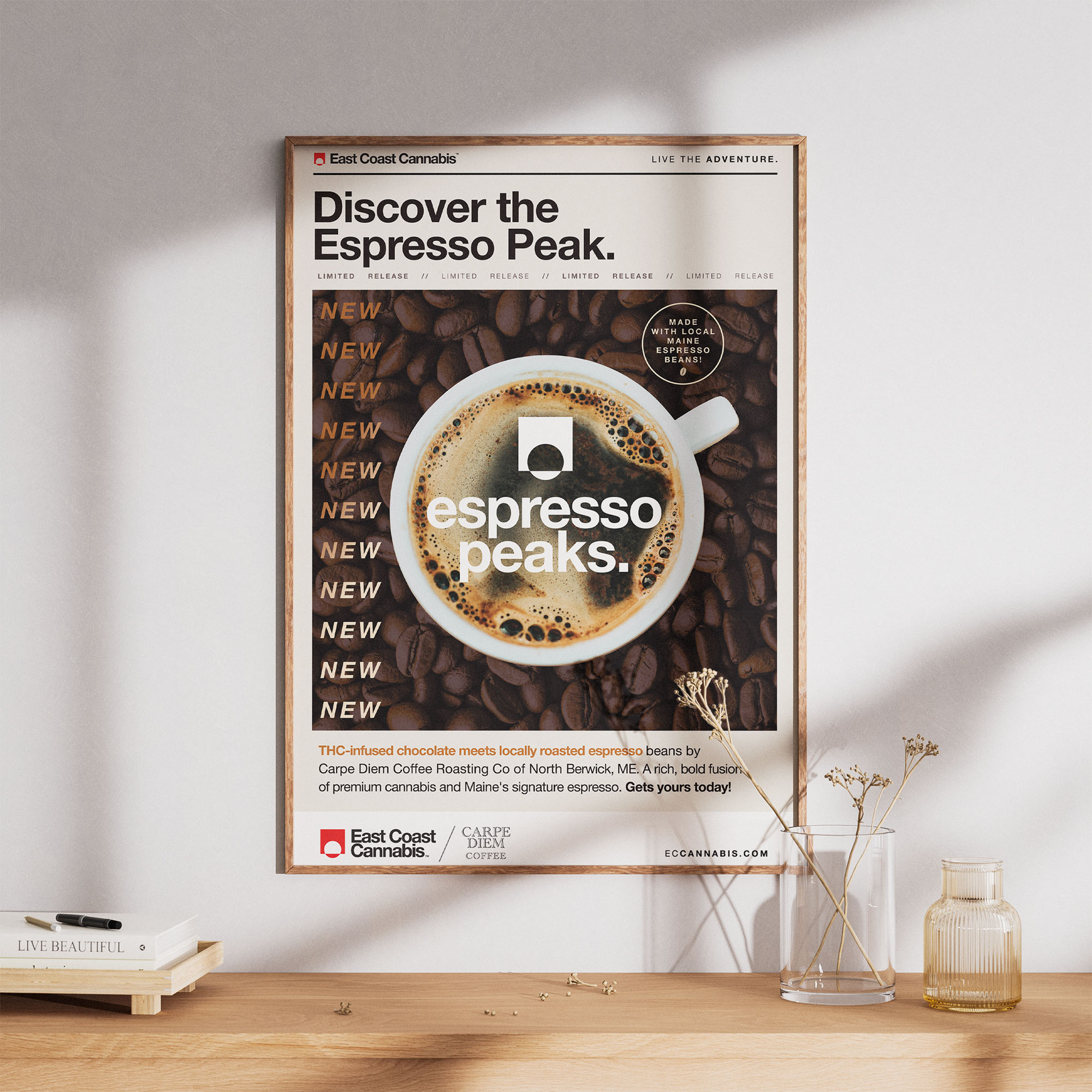
Execution
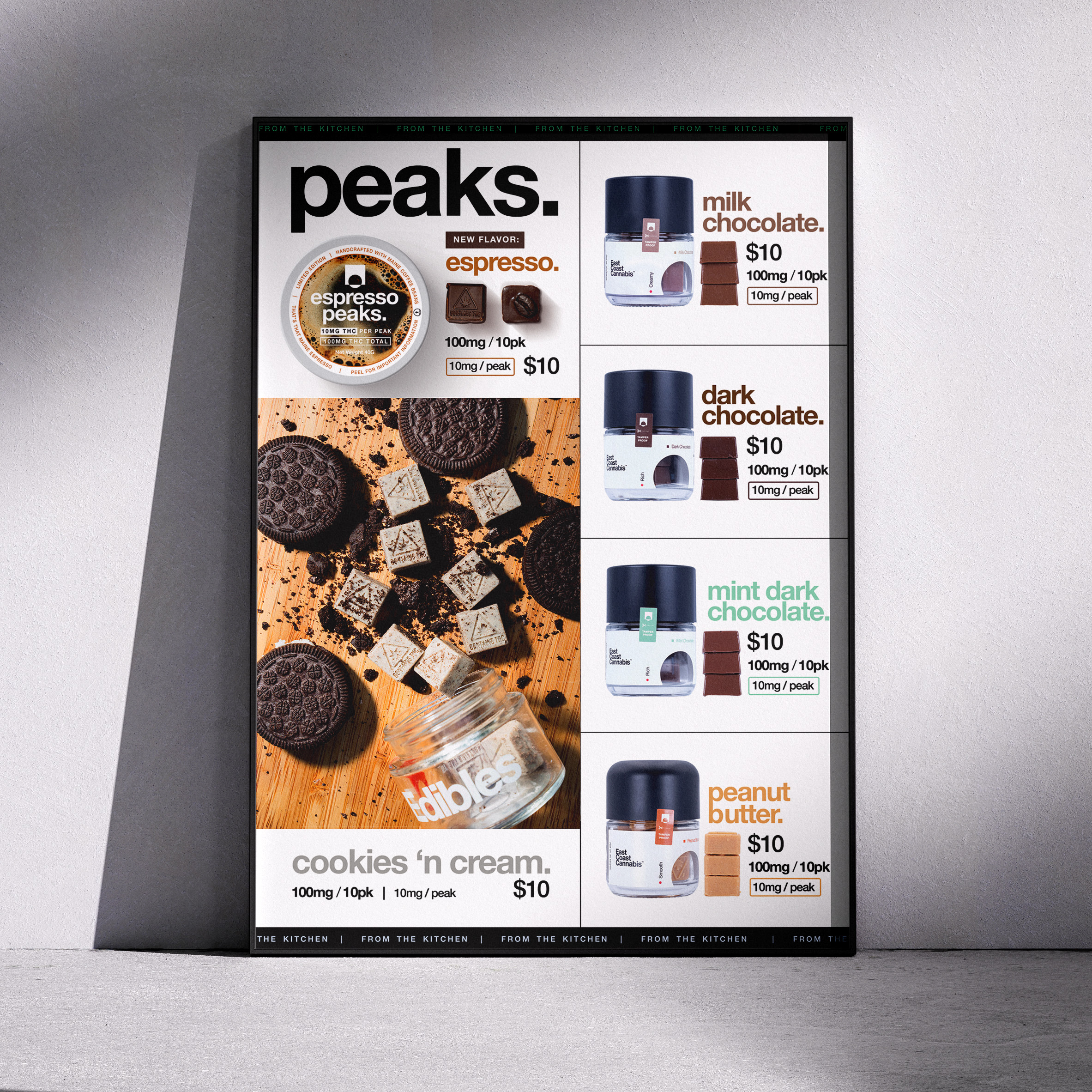
Creative direction focused on layering in more color and delight across the line — especially where there had previously been unused space. The top label, once minimal and mostly white, became an opportunity for both branding and customer engagement. Text was placed on a circular path around the edge of the lid to make the most of the space — adding playful, flavor-specific messaging like “That’s that Maine Espresso,” a nod to the Sabrina Carpenter hit, to inject personality and appeal to younger consumers.
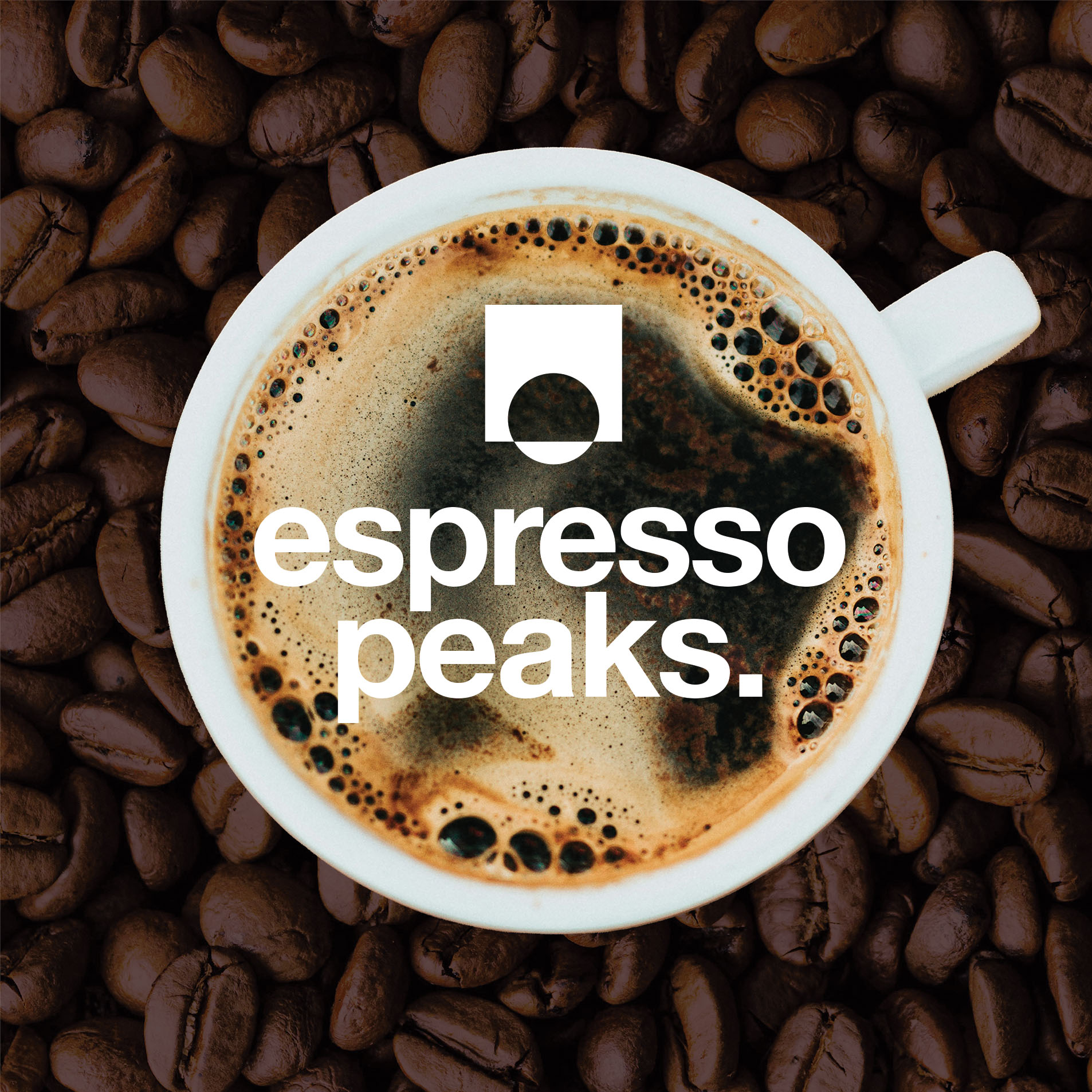
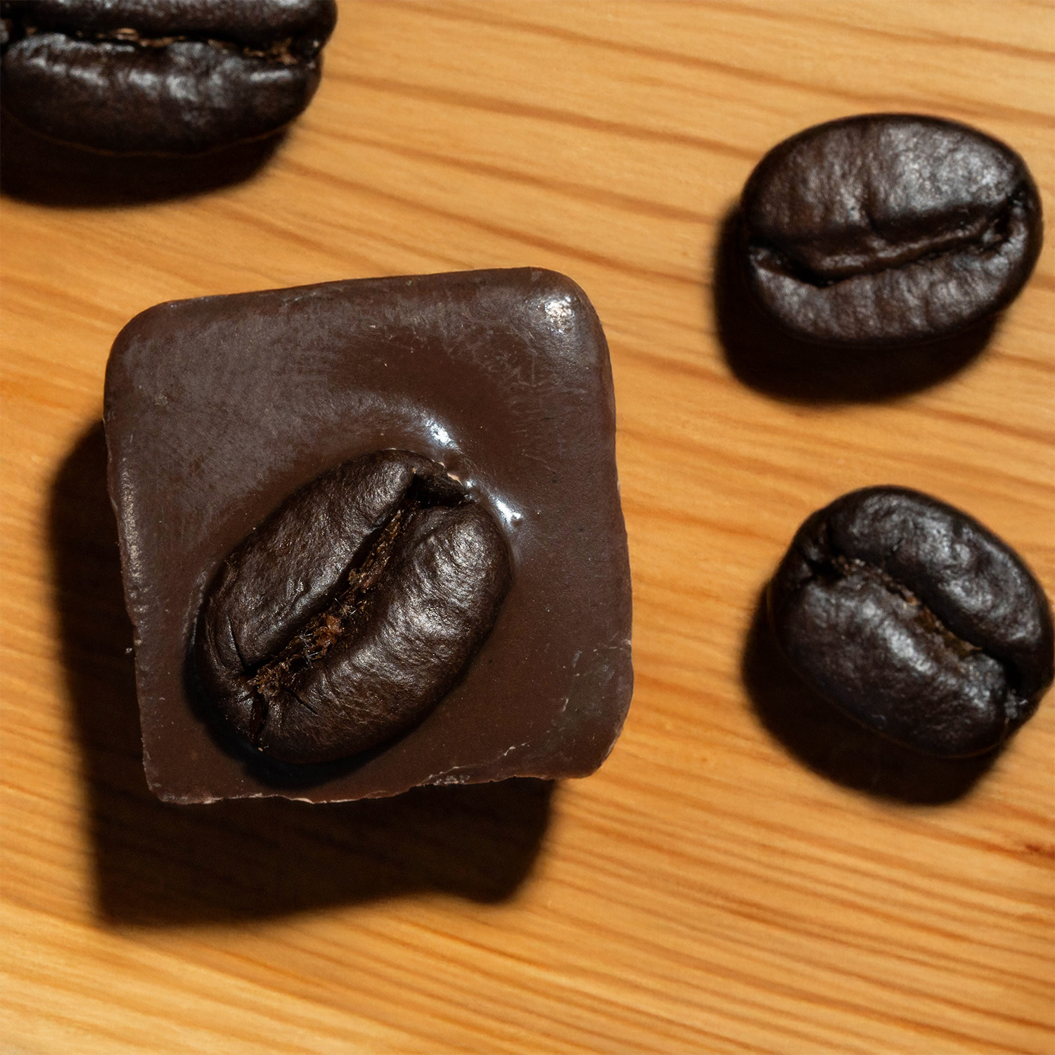
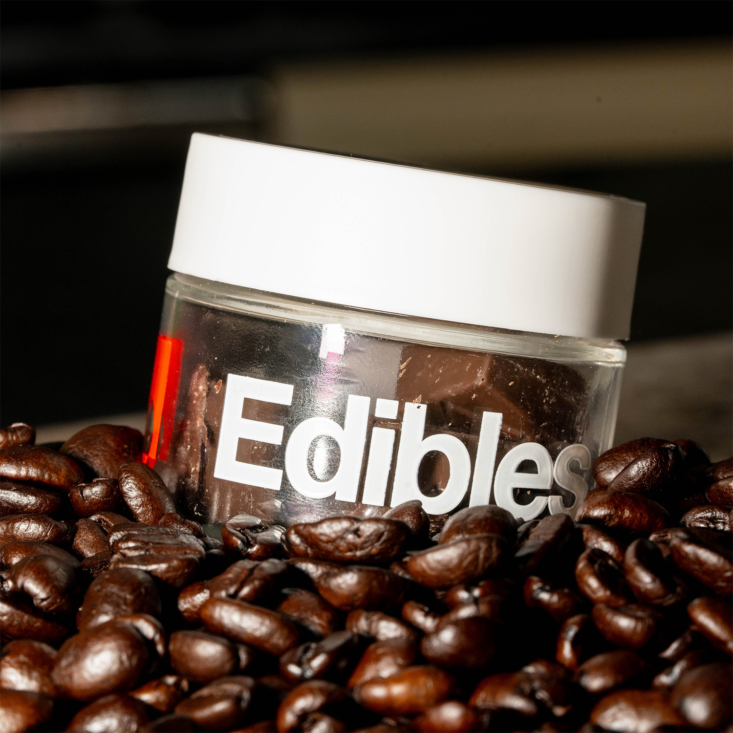
For new flavors like Espresso Peaks and White Chocolate Raspberry, photo art direction used texture and props—espresso beans, berries, and white chocolate—to add depth and tell a visual story.
In addition to packaging and campaign assets, retail signage, wholesale sell sheets, menu graphics, and digital materials were created to support the refreshed product line. A new dieline was also developed for all edibles (gummies and chocolates) — launching in 2025 — to bring even more cohesion and shelf impact to ECC’s growing edible category.

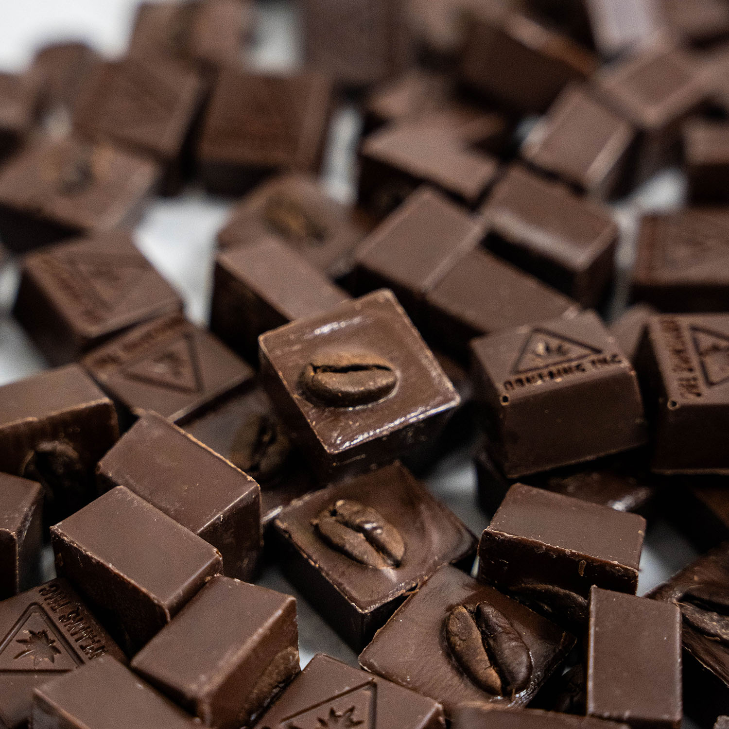
Cannabis chocolate branding tends to lag behind other edible formats — especially in emerging markets. This project brought boutique-style creativity to a category that often feels generic, using color, copy, and styling to create a differentiated experience that still felt aligned with ECC’s brand direction.
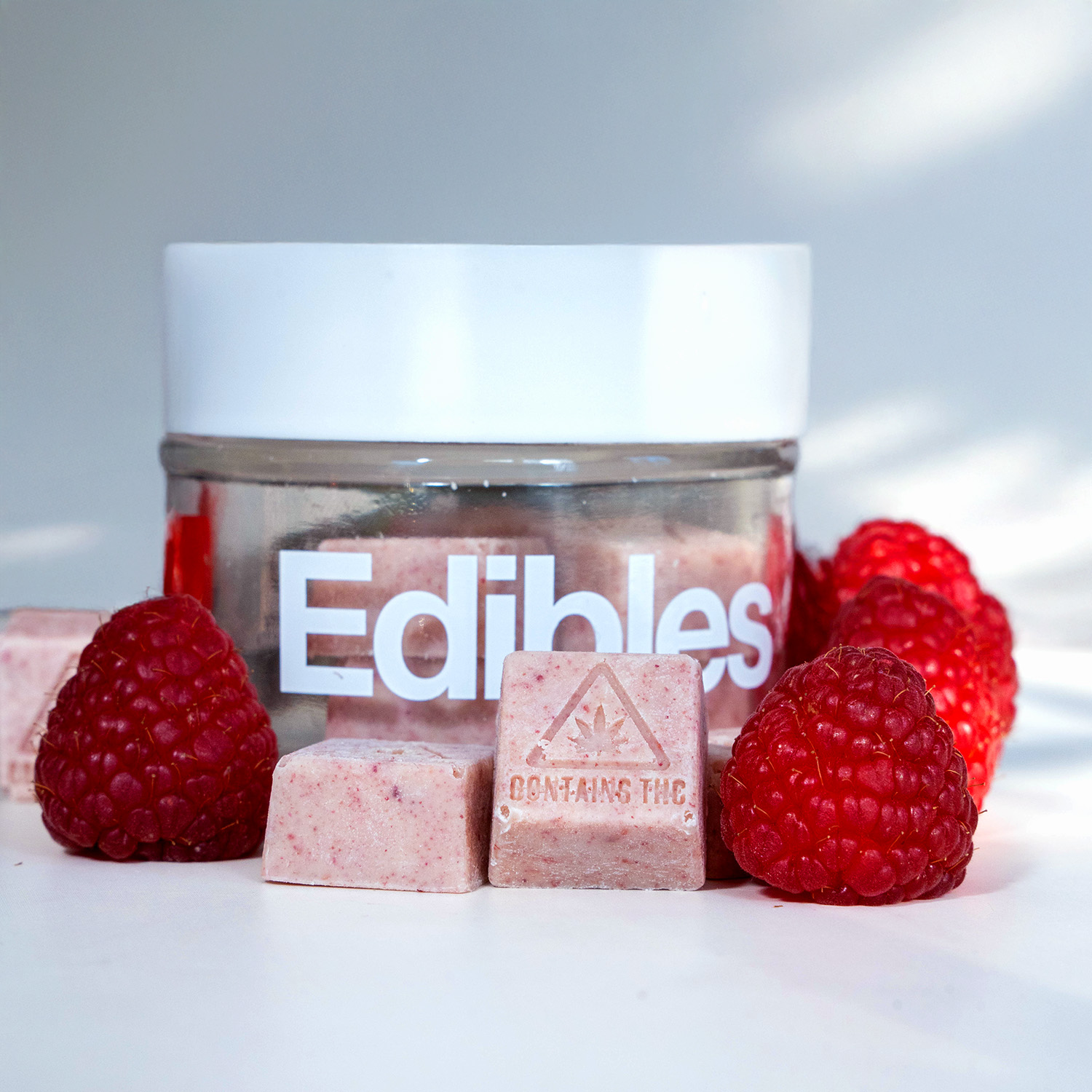
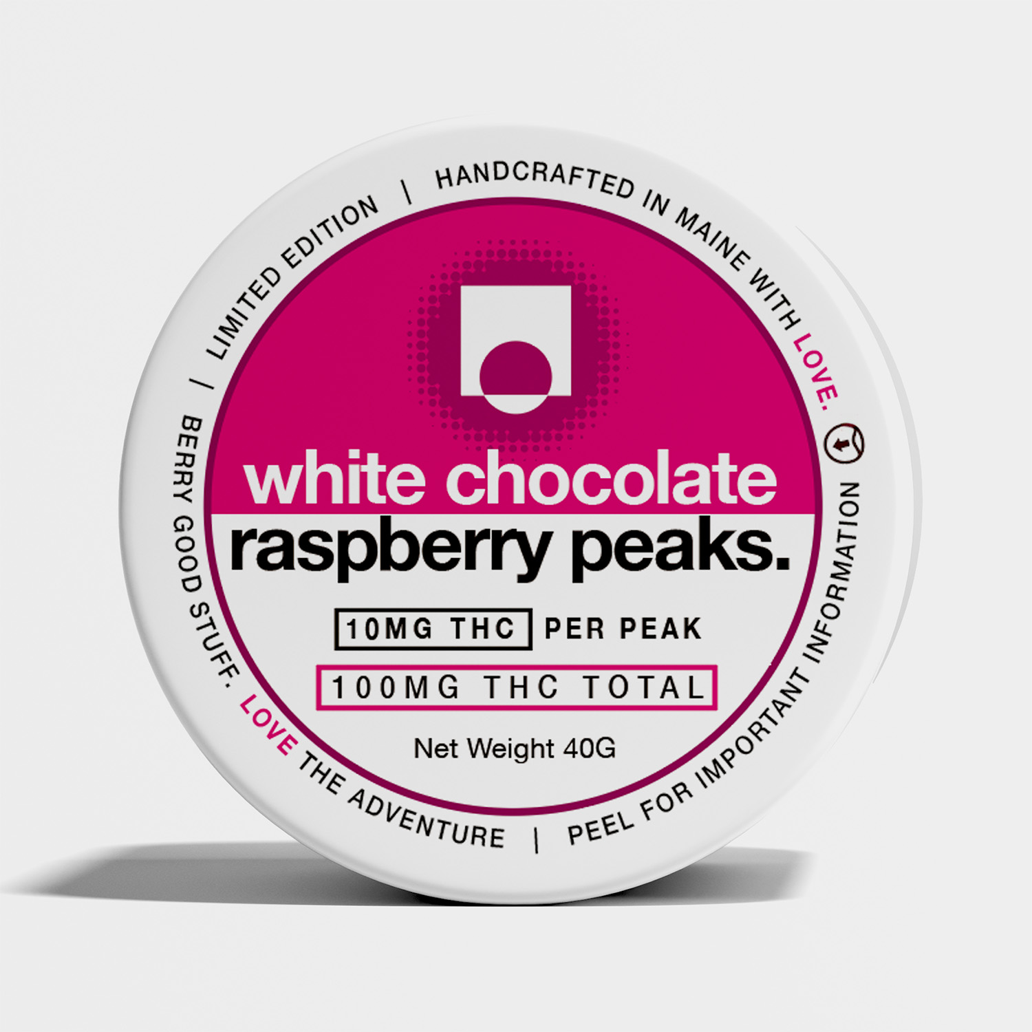
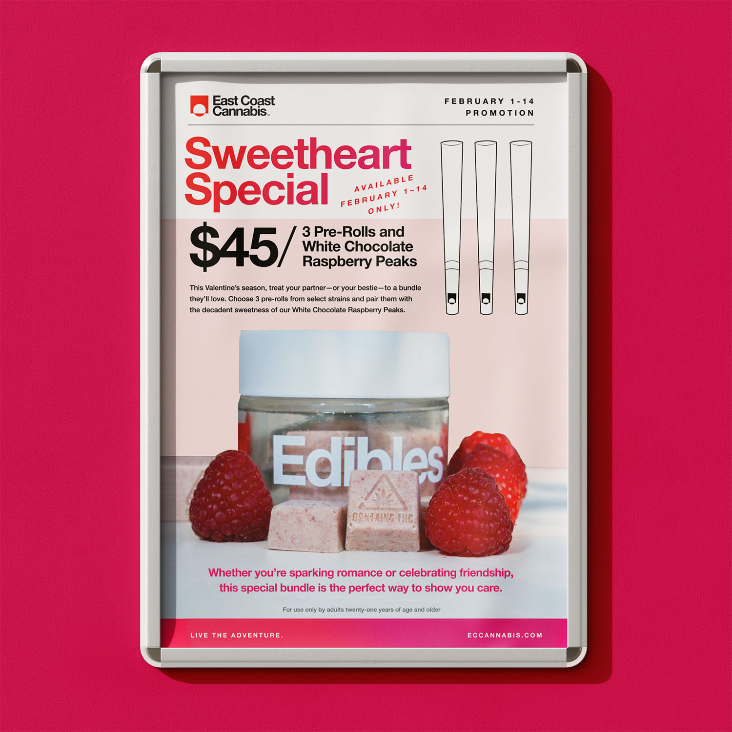
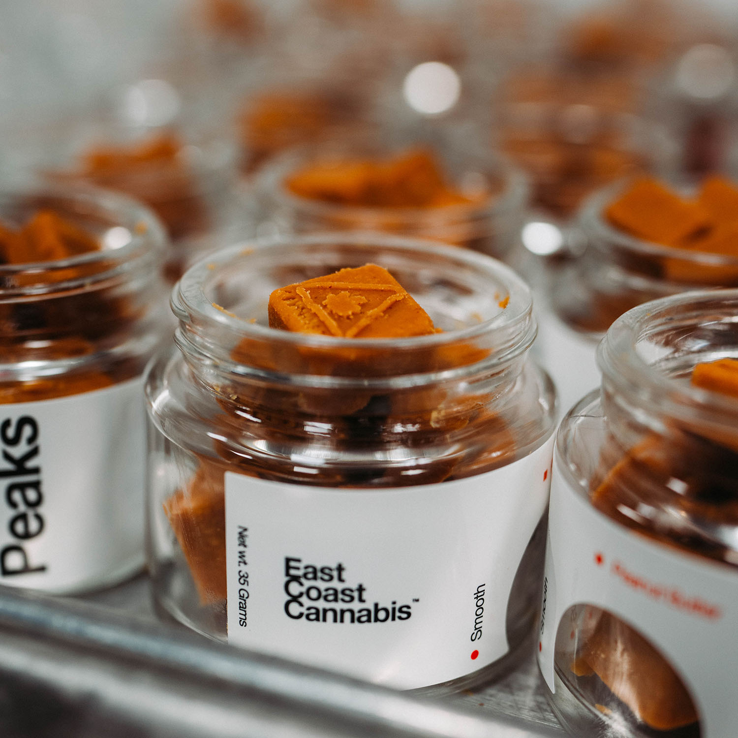
The refreshed Peaks packaging made an immediate impression on shelves. Limited-edition SKUs stood out to new and returning customers, and helped set the tone for ECC’s evolving visual identity — more expressive, more seasonal, and more fun. The design strategy established here laid the groundwork for future edible launches in both style and format.
BRITTELL
©2026 Julie Brittell Design
LINKEDIN ↗
RESUME ↗