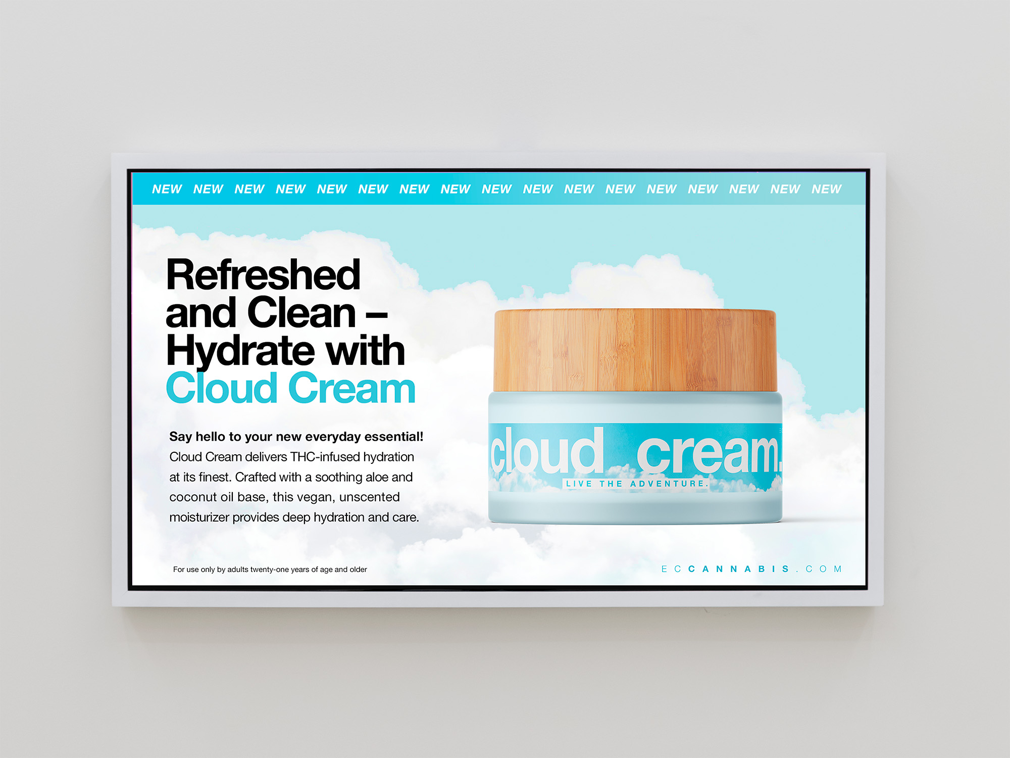
Cloud Cream
A light, modern lotion that feels more
like self-care than a cannabis topical. Packaging and positioning for East Coast Cannabis’s first infused lotion – designed to be elevated, giftable, and perfect for everyday use.
ROLE
Concept Development, Naming, Brand Positioning, Packaging and Campaign Direction
CLIENT
East Coast Cannabis
PHOTOGRAPHY
DLP Social
Product Development / Brand Strategy / Packaging / Cannabis / Wellness
The goal was to make Cloud Cream feel approachable and worth the splurge – without making a single claim.


THE CREATIVE QUESTION:
how do you sell a product without ever saying what it does?


EXECUTION
Creative direction began with the name. Cloud Cream was chosen to evoke the product’s light, airy texture and sense of ease – without overstepping the boundaries of compliance.
It also tied into East Coast Cannabis’s nature-based brand language: mountains, bodies of water, plants.
Visually, the packaging leaned into softness and simplicity:
✓ A calming palette
✓ Cloud Texture
✓ Clean, modern type
The overall aesthetic felt closer to a beauty product than something clinical. Its compact size and polished feel made it especially appealing to tourists and first-time buyers looking for something thoughtful and giftable.


CAMPAIGN CONCEPT:
Say Less
To support the launch, I concepted a micro campaign that leaned into relatable aches and real-life tension points – letting the product name finish the sentence.
Mom neck? Cloud Cream.
Training day? Cloud Cream.
Runner’s knee? Cloud Cream.
Built for digital and in-store use, the campaign was casual, clever, and fully compliant – implying use without saying too much


POSITIONING AND IMPACT
Cloud Cream helped carve out a new lane for cannabis topicals in Maine – one that felt more like skincare. Every detail, from tone of voice to packaging, was crafted to lower the barrier for new consumers and elevate the perception of cannabis wellness within ECC’s lineup.
Available throughout Maine at East Coast Cannabis, Highly and Silver Therapeutics.

BRITTELL
©2026 Julie Brittell Design
LINKEDIN ↗
RESUME ↗